Unleashing a new era of speed
A Waxeye case study
Hyperfibre is the next-generation fibre technology from Chorus that offers speeds never experienced before in New Zealand. It’s exciting stuff that demanded a new microsite to showcase its enormous potential. That’s where we came in – with a cutting-edge user experience prototype that provided the foundation for content creation, design and development.
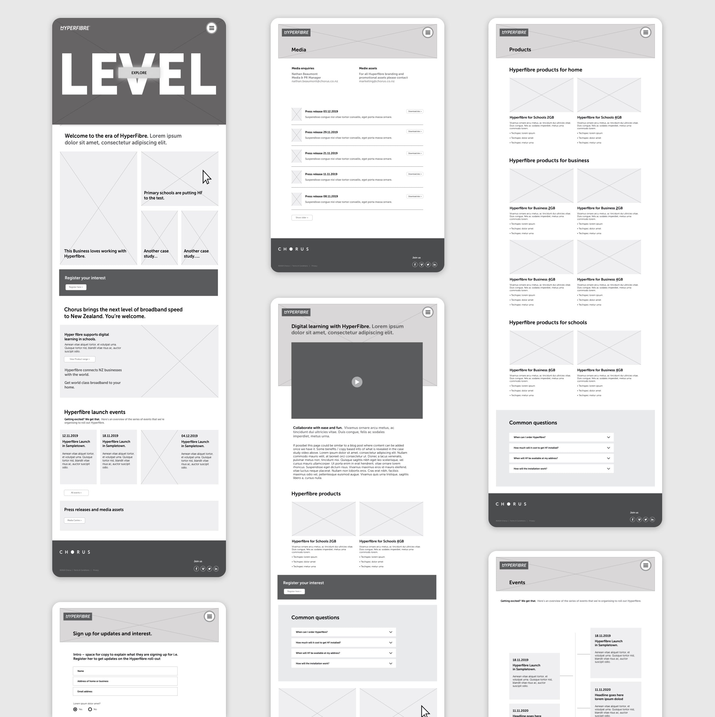
Working collaboratively with Chorus, it’s advertising and design agencies, we created a content-rich, fresh and fast website filled with everything new customers needed to know. Our UX and wireframe prototype was the starting point for this fast moving project.
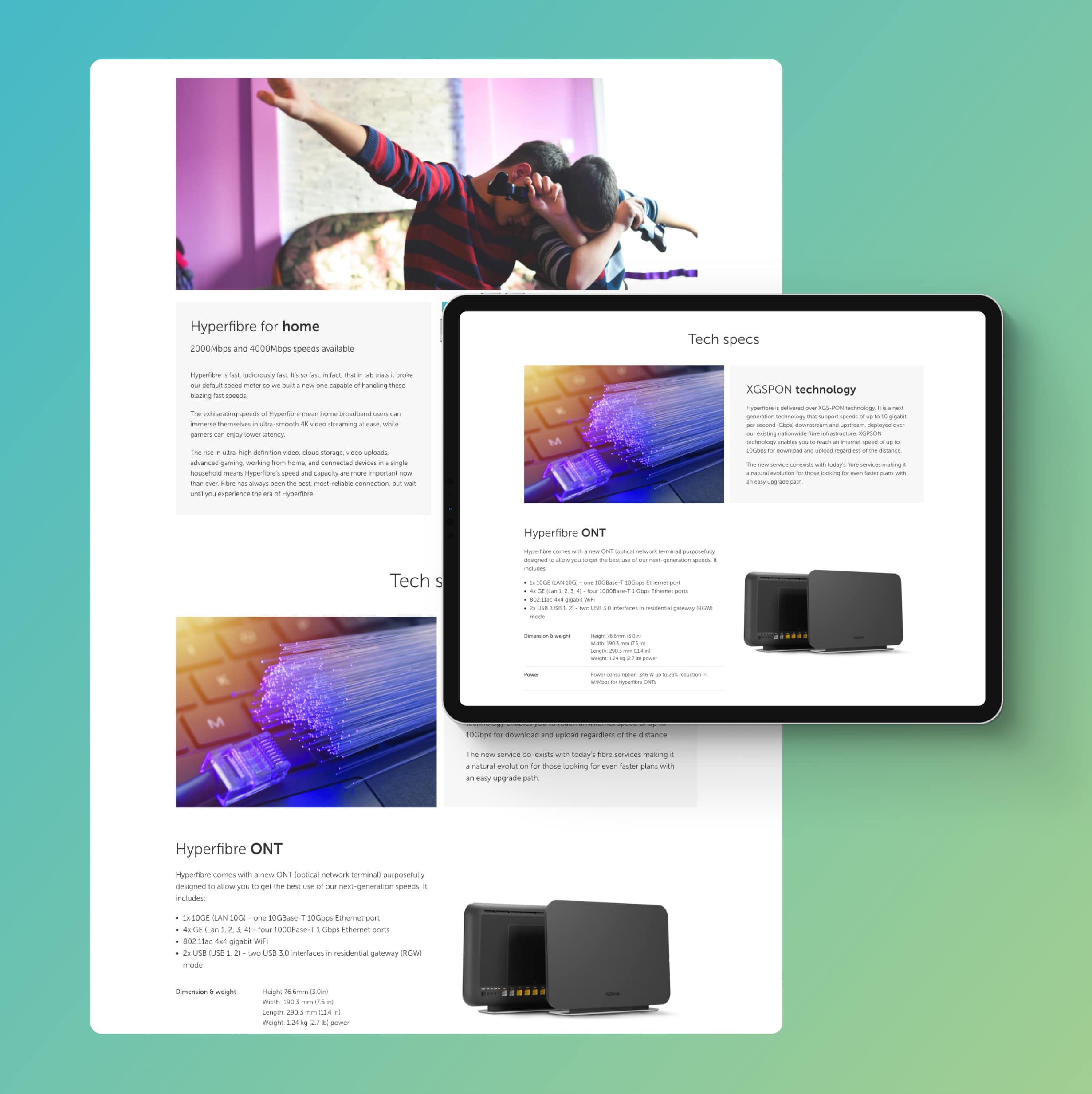
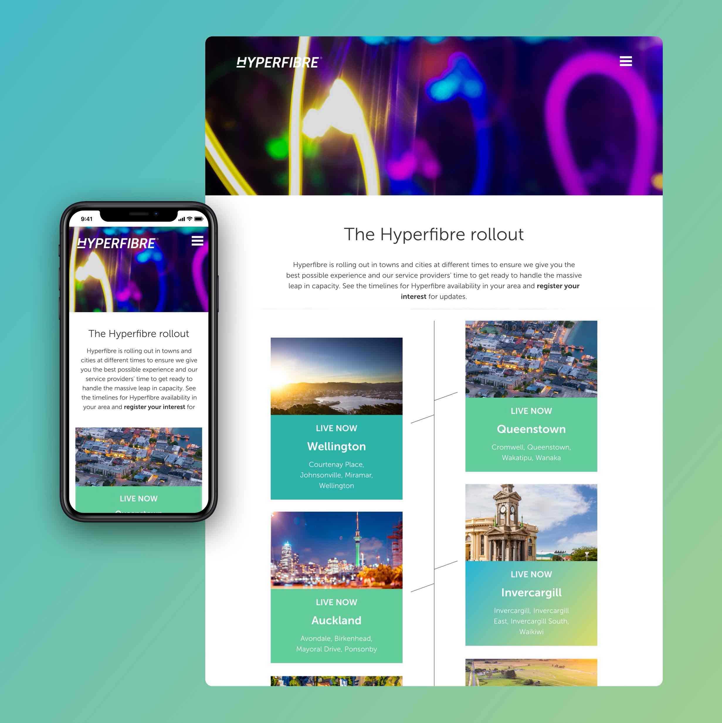
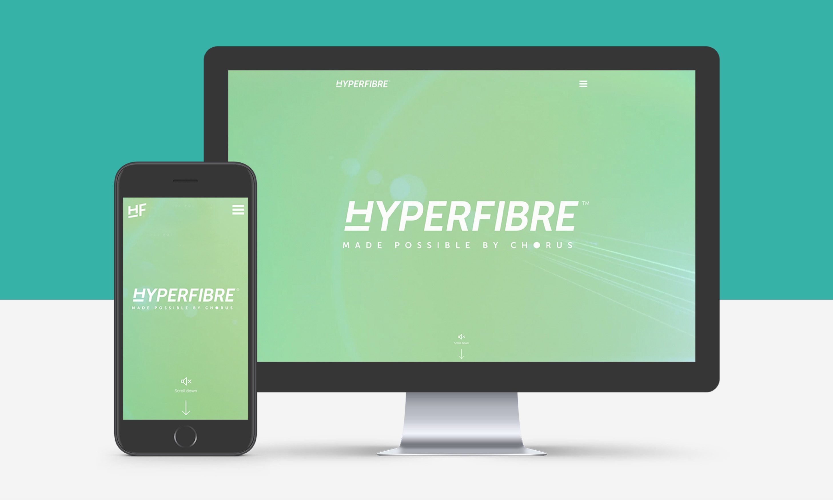
Taking a mobile-first approach paves the way for a great user experience across all devices from mobile phone to tablet and desktop. We translated the Hyperfibre brand guidelines into UI designs that guaranteed brand consistency and maximum impact.
Complex technology messages are often best communicated through simple animation. Following the unique illustration style we had already developed for the Chorus brand, we created a short clip explaining what Hyperfibre is all about.
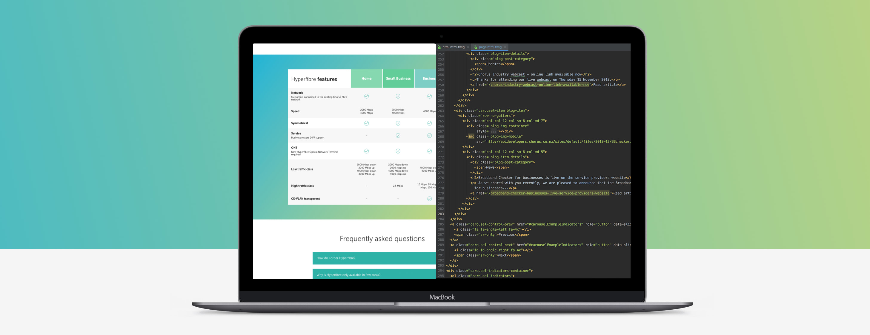
Hyperfibre is fast so the one thing this site just had to be was … fast! Utilising Laravel, HTML5, Vue and a bunch of other technologies, we developed a site powerful enough to accommodate the many bells and whistles that Chorus wanted, like hover effects, page tilts and large video files.
